“YOU ARE A DESIGNER
If you’re thinking tangibly and strategically
about a new solution, you’re designing.
Listen to people and find inspiration in their needs.
Be confident in your own intuition and creativity.
Be comfortable not knowing.
Let yourself learn.
Be willing to experiment. Take risks.
Be okay with not having the ‘right’ answer.
Trust that you’ll find one.
Be optimistic.
See problems as opportunities.
Start with, ‘What if?’ instead of ‘What’s wrong?’
Believe the future will be better.
Get out there.
Step out of your comfort zone.
Learn from the world.
Be open to the new.“—IDEO and +Acumen, Human Centered Design
NEEDS AS ARTICULATED BY THE USER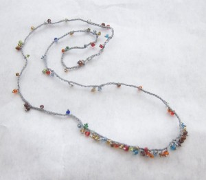 :
:
B: Hi jenny!
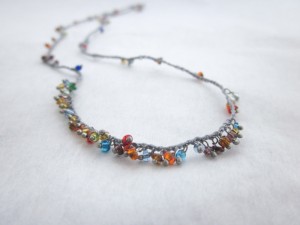
I’ve been wearing this same old necklace for so long that my friends are thinking I’m weird….
So…. I need the same thing in different colors
NEEDS AS UNDERSTOOD (NOT) BY DESIGNER:
J: There are thousands of options!
I have to say I am a bit confused by the request for “the same thing in different colors” since it is a multicolored necklace. Can you be more specific?
Also, I am out of the beads I used in your original necklace—used them all up! I don’t have anything exactly like that anymore.
B: I’m in search of the weighted necklace.
J: […thinking…hmmmm…weighted???]
Further discussion reveals that “weighted” means it has a concentration of beads in the front that makes it heavier in front.
Upshot is, the designer hears: “same thing, but different.” Presses for more specifics on color.
NEEDS AS ARTICULATED BY THE USER:
B: Ok, how about lighter brownish with clear glass seed beads with lots of blues and shiny (hence the clear glass) in my original style that I wear 24-7?
(hi)
I really like the finesse of the random little beads all around….
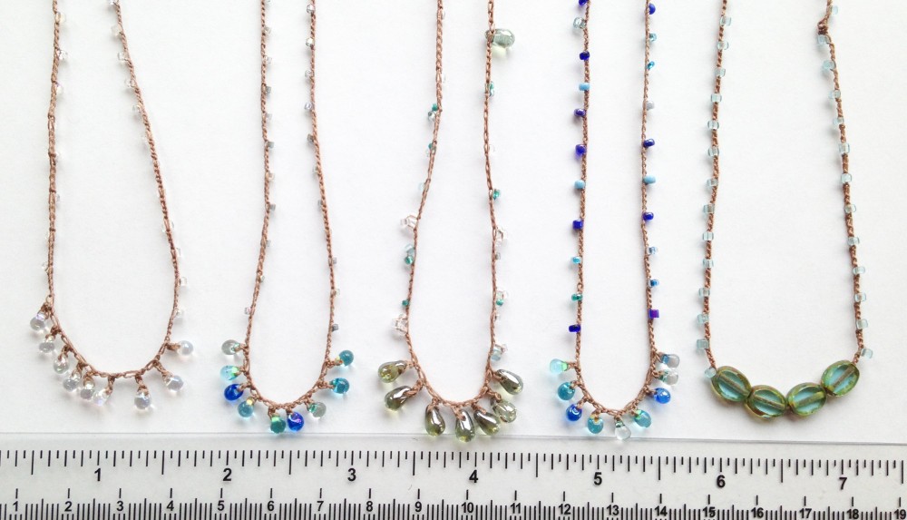
DESIGNER MAKES 5 PROTOTYPES BASED ON WHAT ARE PERCEIVED TO BE THE DIMENSIONS OF INTEREST:
J: Variables pictured include:
strand color: clear or iridescent or blue
strand beads: one kind or mixed
strand bead spacing: regular or irregular
fringe: yes or no
From left to right:
- mixed clear beads, regular spacing, clear iridescent fringe
- iridescent clear beads, regular spacing, mixed blue fringe
- mixed clear and blue beads, irregular spacing and clumps, iridescent tan fringe
- mixed blue beads, regular spacing, mixed blue fringe
- pale blue vintage beads, regular spacing, czech glass bead accent (and I can make it with the divot/join at the back so it would be less visible)
Is this the right direction? What elements appeal?
USER ARTICULATES GAPS:
B: So, I like #3 the best!
I like the randomly spaced little beads and clumps around the neck, but I don’t like the largest beads (they kinda stick out to me). The colors look good I think—a little hard to tell.
I’m not sold on the greenish beads at the bottom though…. I would rather stay away from green and go for clears (or light blueish) in vintage/unique and, I have an idea for another design!
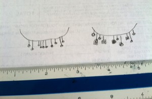
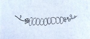
How about a bottom fringe that is not even? More clumpy—2 together then 3 then 1 then 1 then 3? Or Maybe even a little longer then a little itty bit shorter then longer, longer then short? Hmm, I think that may be a good idea… there, I just drew some ideas and will attach the photo! But maybe wider than the 1-1/2” I drew?
Attached is a photo of my beloved necklace. I noticed it has about 3-inches of added “fringe” in front—I like that—but those are littler beads so maybe 3-inches would be too much?
#5 is my second choice but with the random clumps around the neck. No green though.
DIMENSIONS OF INTEREST are now narrowed down to: strand of mixed beads, irregular clumps, blue and clear colors on tan thread, “fringe” or accent section still needs work.
DESIGNER MAKES A PROTOTYPE INSPIRED BY USER SKETCH: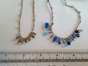
J: Big mixed blue fringe compared to tan/green fringe.
USER ARTICULATES GAPS:
B: Way too big
Remember i love my little guys!
J: That’s what I thought, but it was a fun idea!
I can’t see a way to do this varied length and shape fringe with smaller beads—I only have so many smaller beads—but I have another idea.
What color/s do you prefer for the accent section? Are these blues okay or are they too blue? I know to avoid green…
B: They are a little too blue—too bright. It would be nice to wear this
necklace with everything—maybe more clears. The rope part looks great
though.
J: I agree, too blue.
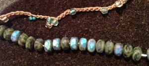
But just found these little guys (~5x3mm) in a drawer. They look like natural stone and have an iridescent blue flash that changes as you move. Thinking a segment with 7 or 9 of these all lined up would make a nice accent. It would be like necklace #5 but with these instead of the green.
B: By George I think you’ve got it!
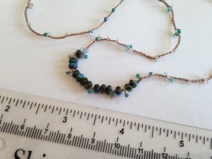
Can there be a few little clumps of little beads right next to the ends of the row of bigger beads to make a nice transition?
Here is a picture:
THIRD ITERATION: STRAND AS SPECIFIED, NEW FRINGE CONCEPT
J: I think we’ve got ‘er! At least I like it a lot. Feminine, earthy, classic, adaptable, and TINY. It fits my criteria of looking like something that’s always been there. I took your idea of the clusters on the ends of the larger beads and then that led me to adding little fringe-like elements in between to break up the focal. Something that NEVER would have occurred to me before. If you don’t like it, easy enough to leave out those fringes, but I am very excited about the innovation.
And she loved it.
A NEW CREATION IS BORN: THE SAME, BUT DIFFERENT!
Lots of work, three iterations, but new combinations and new techniques invented in the process.
Leave a Reply