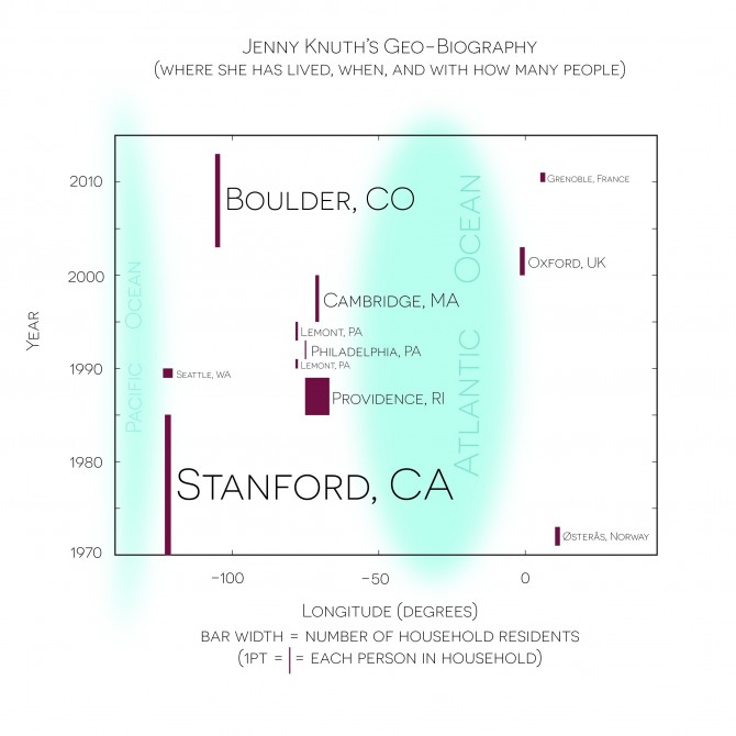
I wanted to use data and a graphic to tell a biographical story. For this visualization I chose time and place as relevant dimensions. It turns out there is something of a coastal affinity at first, a balance of place, and then a growing anchor in the middle.
To add more information I experimented with other variables such as incorporating the color of the logo of the university prominent in each town (usually the reason that I lived in that town) or the color of the car I drove in each location. Instead, I settled on the width of the line representing the number of people in the household. The width of this line shows a progression from a nuclear family to having housemates as a young adult, to a brief stint of living alone, then with a partner, and then finally building another nuclear family.