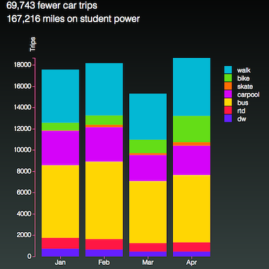
This bar graph shows the areal extent of sea ice in the northern hemisphere for each year from 1979–2014.
The goal is to show some of the possibilities of interactive bar charts. Each bar’s length and color varies dynamically with the data. When the mouse moves over the data, the surface area of sea ice is shown and the bar is highlighted. Lots of information is conveyed very quickly and easily.
The web is moving well beyond imparting information via text and images. It is now an ideal platform for exploration via interactive data visualizations. Some further possibilities for this bar chart include clicking on a bar to see images, summaries, stories, or the data for the entire year. I am currently working to connect these bars with corresponding maps of sea ice extent for each year. Stay tuned!
The underlying code for this chart (D3.js) is highly flexible: modify the underlying data file and the chart updates automatically and scales correctly.
Data are from the Sea Ice Index found at NSIDC.org.
Design, interaction, and programming by Jenny Knuth.
Reference: Fetterer, F., K. Knowles, W. Meier, and M. Savoie. 2002, updated daily. Sea Ice Index. Image files August, Northern Hemisphere, Sea Ice Extent. Boulder, Colorado USA: National Snow and Ice Data Center. http://dx.doi.org/10.7265/N5QJ7F7W.
