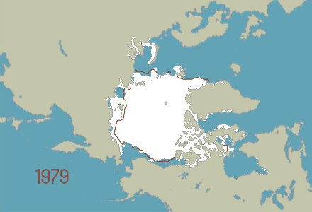
Shown above is an animation of sea ice extent in the northern hemisphere from 1979–2014 using a snapshot from every August 15th/16th. The brown line represents the 30-year average of sea ice extent.
Why August? A quick preliminary plot of the data revealed that sea ice minimum is changing more rapidly than the sea ice maximum. Since sea ice minimum tells the story, it was chosen as the salient feature to visualize. When is sea ice at its minimum extent? Around August 15th, so that was the date selected. (If no image was available for August 15th, the image from August 16th was selected.)
This animation will soon be more interactive. At present, refresh your browser or click on the image to play/replay the animation.
Data are from the Sea Ice Index found at NSIDC.org.
Reference: Fetterer, F., K. Knowles, W. Meier, and M. Savoie. 2002, updated daily. Sea Ice Index. Image files August, Northern Hemisphere, Sea Ice Extent. Boulder, Colorado USA: National Snow and Ice Data Center. http://dx.doi.org/10.7265/N5QJ7F7W.